The pattern is older than the beachwear silhouette
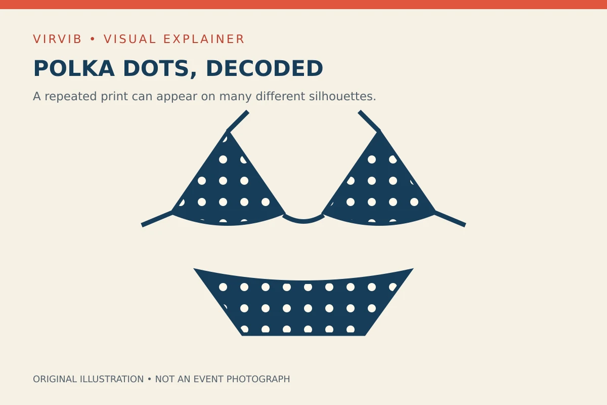
A polka-dot bikini combines two separate design ideas: a repeated circular print and a two-piece swimsuit. Neither tells the whole story of the other. A garment can change its neckline, straps, coverage or construction while keeping the same pattern. Equally, the same cut can look substantially different when the dots become larger, closer together or more strongly contrasted against the background. That distinction is the starting point for understanding a familiar beachwear image.
There are useful historical objects behind the familiarity. The Smithsonian's National Museum of American History holds a two-piece swimsuit dated between 1960 and 1963 and made by Mabs of Hollywood. The museum describes a dark purple ground with white polka dots, a triangular top, ruffled details and clear plastic rings. It is a specific surviving garment, rather than evidence that every swimsuit of the period followed the same design or that one manufacturer invented the print.
The dots themselves have an earlier fashion history. The Fashion Institute of Technology's Fashion History Timeline discusses their presence in dress around 1880. That places a dotted textile vocabulary well before the modern bikini. The point is not to draw a straight line between one nineteenth-century dress and every contemporary swimsuit. It is to recognize that a recurring print can travel between very different garment types, settings and periods without belonging exclusively to any one of them.
The Victoria and Albert Museum adds another complication to an overly simple origin story. Its account of swimming costumes includes a yellow wool jersey two-piece from 1937–39, predating the 1946 designs commonly associated with the modern bikini. It discusses Jacques Heim and Louis Réard in that later development. A two-piece garment, the exposure of the midriff and the naming of the bikini are related historical questions, but they are not interchangeable dates or claims of invention.
The museum also connects the bikini name with Bikini Atoll and the displacement of Marshall Islanders for United States nuclear testing in 1946. That history sits behind a word now often used casually in fashion. It deserves recognition alongside the garment's design history. The illustrations here are newly drawn diagrams: they explain pattern and shape without reproducing restricted museum photographs or pretending to show the historical objects described in the collection records.
Sources: Smithsonian — Mabs of Hollywood two-piece, 1960–1963 ↗ · FIT Fashion History Timeline — 1880 ↗ · Victoria and Albert Museum — seven swimming costumes ↗
How size, spacing and contrast change the visual rhythm
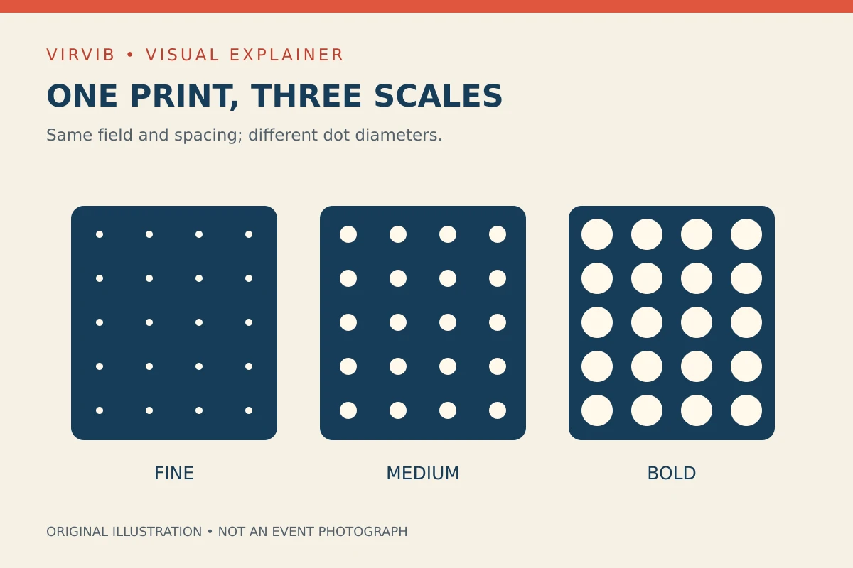
The accompanying swatch illustration keeps three things constant: the size of each rectangular field, its navy background and the positions of the dots. Only the diameter changes. In the fine-dot version, more of the background remains visible. In the bold version, the pale circles occupy a larger share of the field. The medium version sits between those two arrangements. This is a controlled visual comparison, rather than a claim about which scale is currently selling best.
Spacing is a separate variable. Two patterns can use circles of the same diameter yet feel different because the gap between them changes. A generous gap leaves the background as a more continuous surface. A tight arrangement makes the repeated shapes more dominant. When looking at photographs, it helps to ask whether a perceived difference comes from bigger circles, closer circles or simply a closer camera view. A cropped image can make an unchanged pattern appear much larger.
Contrast creates another distinction. Pale circles against navy have a clear edge in our diagram. If the circles and background were closer in brightness, their boundaries would be less emphatic. Color names alone do not settle that relationship: two blues can differ sharply in brightness, while two differently named colors can sit closer together. The visual effect belongs to the particular combination, rather than to a universal rule that every dotted swimsuit must use white on a dark ground.
Garment shape interrupts a repeated pattern. A seam can break a row; a gathered edge can compress the spacing; a narrow strap may contain only part of a circle. Those interruptions are not automatically faults. They are features to examine when comparing a flat textile swatch with a finished garment. A repeating pattern on an uninterrupted rectangle cannot show exactly how the same print will meet every join, fold or curved edge of a constructed swimsuit.
VIRVIB design analysis: these observations offer a vocabulary for describing an outfit without ranking bodies or inventing a trend. A reader can say that a print is fine, widely spaced and low contrast, or bold, tightly arranged and sharply contrasted. Those descriptions are more informative than assuming every polka-dot look is identical. They also make it possible to compare garments while keeping the discussion focused on design choices visible in the material.
Sources: Smithsonian — Mabs of Hollywood two-piece, 1960–1963 ↗ · FIT Fashion History Timeline — 1880 ↗
Read the construction as carefully as the photograph
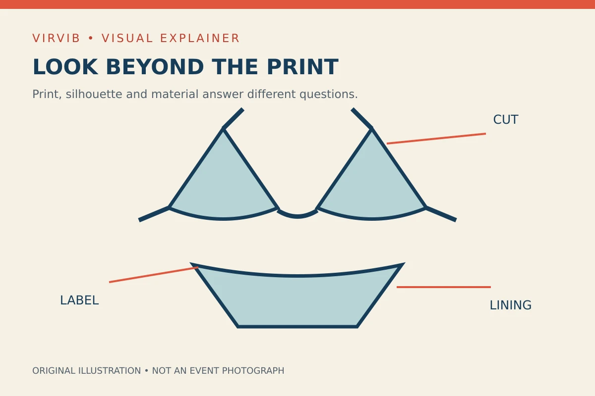
A print description is only one part of a garment description. It does not specify fiber content, lining, fastening, stretch, care instructions or the way a particular size fits. Our second garment diagram therefore separates the overall cut from construction details and labeling. It is a conceptual drawing, not a drawing of an item for sale. The callouts identify questions a product description may answer; they do not certify a fabric or promise a level of support.
The Federal Trade Commission's textile guidance explains that many covered products require information including fiber content, country of origin and the identity of the responsible manufacturer or marketer. Its rules have defined scopes and exceptions. For a reader examining clothing, the useful distinction is between an appearance claim and an identification label. A photograph can show pale circles on a dark surface, while a label provides a different kind of information about the product being described.
Care information answers a further question: how the maker instructs an owner to handle that particular garment. It should be read for the actual item rather than borrowed from another swimsuit with a similar print. Two visually similar pieces can use different fibers, linings and trims. The dots alone establish none of those details, and they cannot establish a technical claim about protection, durability or performance. Such claims need their own product-specific documentation.
A photograph has limits of its own. Lighting can alter the apparent color; a pose can conceal fastenings; an editorial crop can remove the waistband or straps. Those are reasons to seek additional views when trying to understand a design. They are not reasons to invent a hidden feature or infer that a person pictured endorses a product. An archive photograph also needs its original date, rather than being silently presented as a new beach appearance.
The enduring interest of the polka-dot bikini is consequently larger than a single gallery. Museum collections preserve examples of garments; fashion histories trace earlier uses of the print; careful visual description explains what changes from one design to another. Together, those approaches let readers appreciate a familiar motif with more precision. They also leave room for a simple pleasure: noticing how a small repeated circle can give a straightforward garment a distinctive visual character.
Prepared with AI assistance. Source-based reporting checked on 2026-10-26. This article does not update automatically. Read our editorial standards.